Center Parcs
Center Parcs is the leading UK holiday destination.
During my time as lead designer at Code Computerlove Center Parcs approached us reinvent their online presence and update a very outdated but heavily used main website along with their secondary Spa website – Aqua Sana.
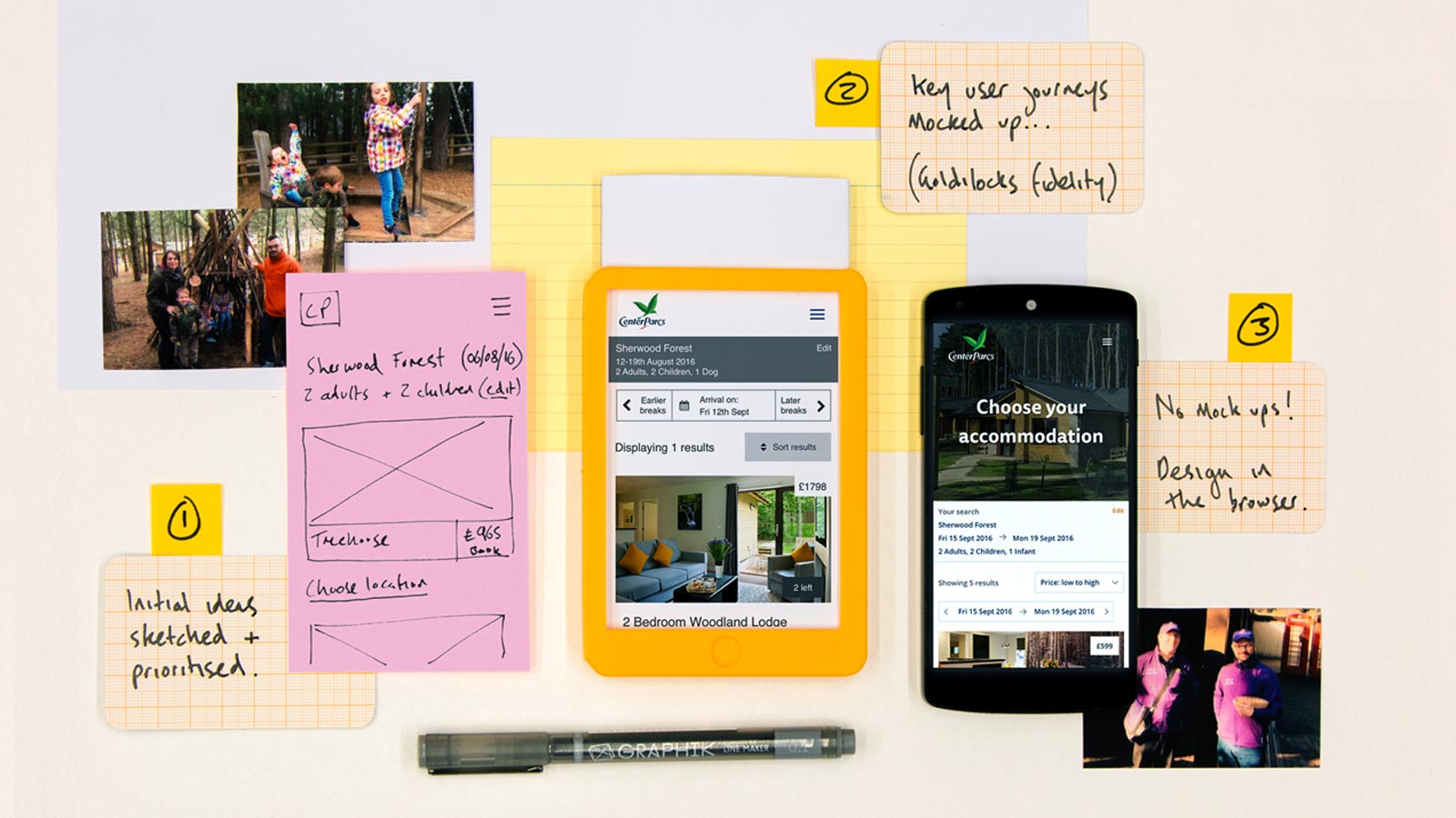
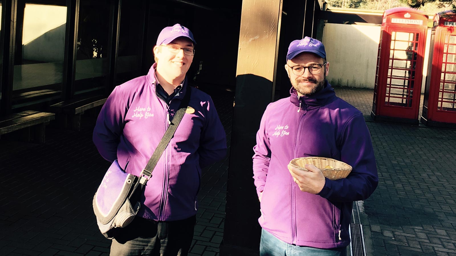
After a successful pitch process we spent time with the Center Parcs team to discuss their requirements and ambitions through workshop sessions and stakeholder interviews on site in Sherwood Forest.
We started the project by getting a deep understanding of the users by speaking with real people. Luckily Center Parcs has a very active customer base who are very open with getting involved with anything Center Parcs! We widened our search to also include those who have not been to Center Parcs before but are considering a UK holiday and to get a polarising opinion we also recruited people with an active distaste in Center Parcs to understand why they aren’t open to the idea of a UK forest holiday.
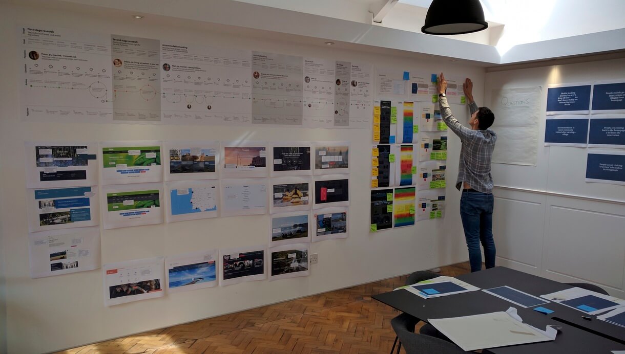
We built up a set of personas that explored each situation and attitude and plotted their real life experiences onto a user experience map
Once we had a good understanding of our audience and the product requirements we planned a programme of design sprints to explore and test our hypothesis set to define a new Center Parcs experience.
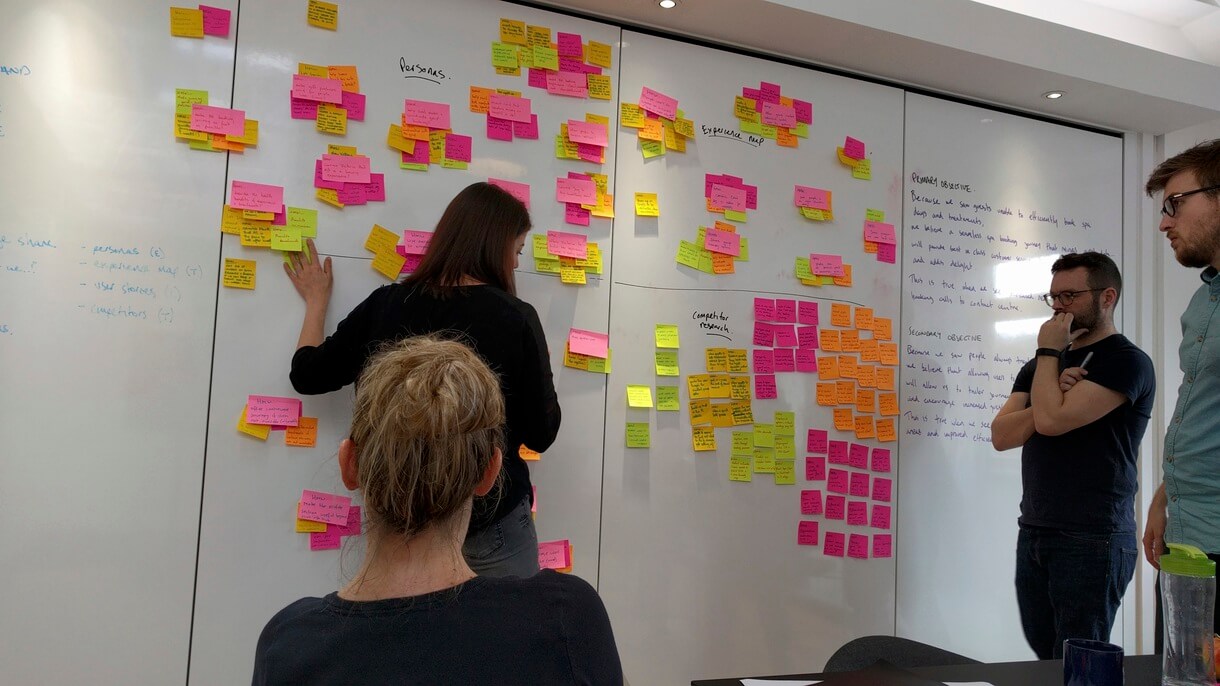
During these sprints we had various Center Parcs stakeholders take part in each session allowing the client to be a part of our design process and ensure their voice was heard and allow them to have their part in the website we created together.
We explored many options for both websites from the radical to the realistic which built upon the existing functionality and concentrated on making a more usable experience to taking the product into new directions by trying out new technology allowing users to view and book real time activities through a mobile itinerary.

We ran each prototype through lab sessions in-house inviting in some of the customers we interviewed early on and a new set of agnostics. We ran a POINT exercise (Positives, Opportunities, Issues and New Thinking) to map the various aspects of feedback into actionable insights.
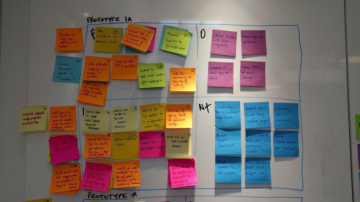
After the succession of design sprints we combined a lot of the prototype features into one journey that resonated well with all of our personas allowing them to accomplish their various requirements.
Due to my front-end skillset we used Pattern Lab to create the deliverables which at the time was a radical decision from the perspective of the agency who generally had always provided flats (which is also what Center Parcs expected).
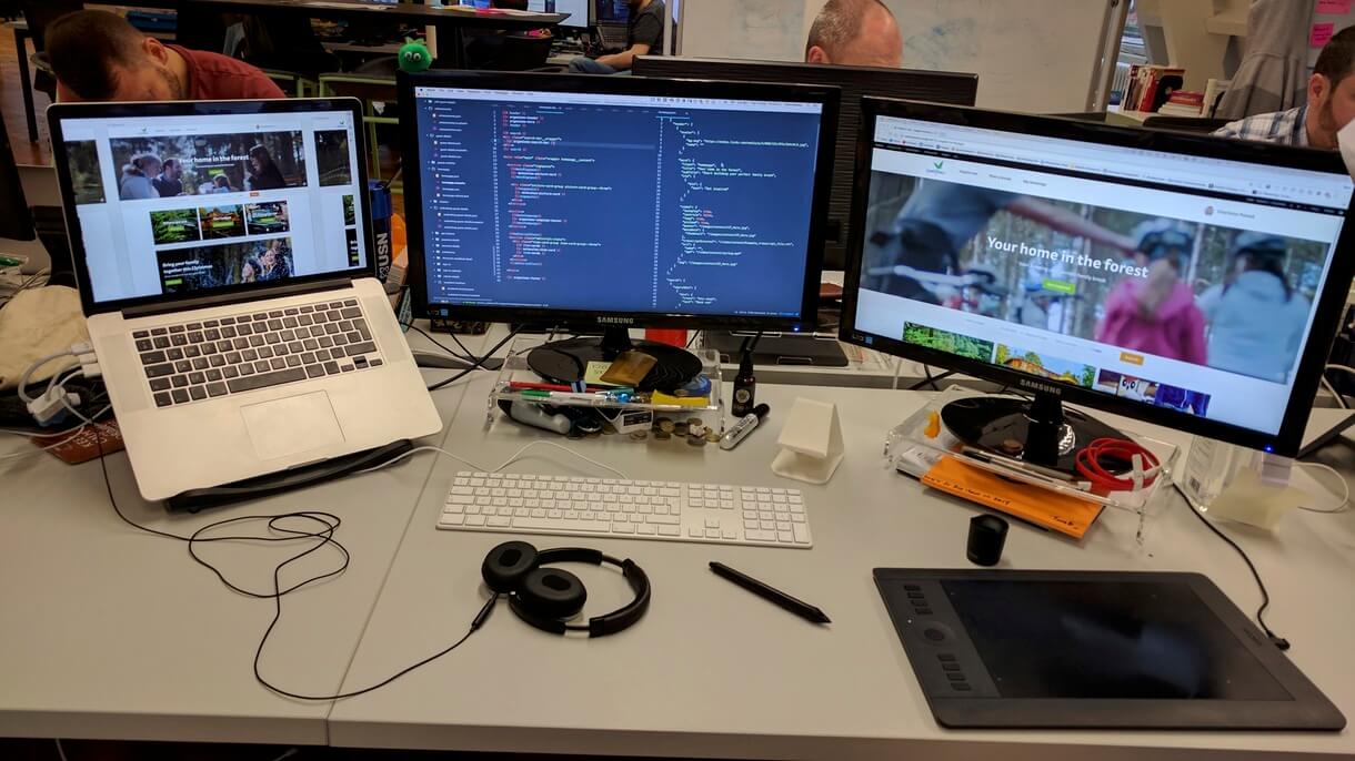
During our first checkin during this period we put the screens up as we normally would if we were presenting flats, once we talked through the decision points and feedback we moved onto the responsive nature of the design (something new to Center Parcs) of which the majority of the room expected a new set of flats; however, we simply resized the browser to some astonished faces! A very good reaction that got Center Parcs 100% bought into our process.
We continued to evolve the website and due to the rapid nature of our process we were able to include a large number of the experimental features we explored during the sprint processes. Everything was tested with users as we went along in labs at various locations across the UK to ensure we sampled a broad range of users.
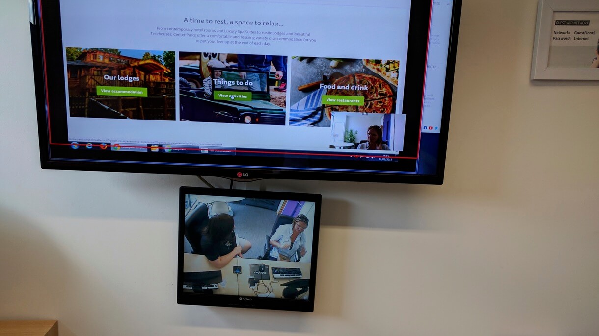
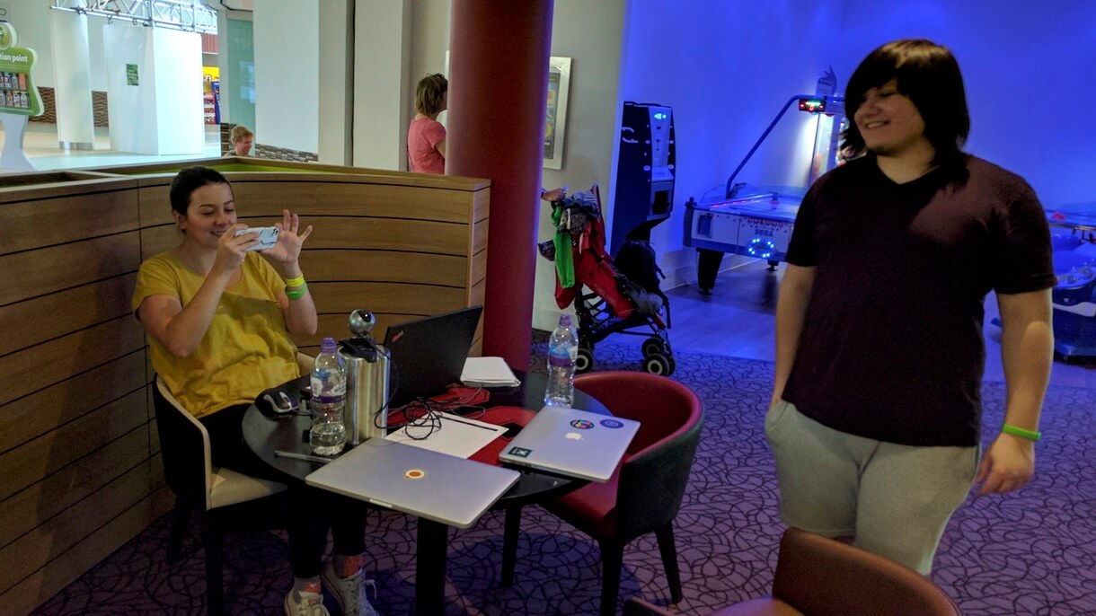
Luckily we were also able to use the Center Parcs locations as labs to gather real time feedback from people who had recently booked through the existing website and for us to understand their painpoints and get great feedback from them around the new features.
The new Center Parcs
The Pattern Lab is available to view which will give insights into the atomic structure of the Center Parcs website.
The live site is available at centerparcs.co.uk

