A guide to creating grid systems that are built around your content
There is an underlying principle to designing layouts effectively and that is the humble grid. Grids are everywhere and you’ve most likely not noticed them or paid much attention to them, that’s because a grid isn’t there to be the star of the show. The grid is there to guide you in creating the star.
One of the simplest grids that you most likely use everyday is a simple piece of lined paper. It’s tough to write neatly on a blank piece of paper, the lines guide you to write better and thusly create a better document. The same principle applies to grids in design, it’s hard to create a layout without any guidance as elements won’t have structure.
Grid considerations
As with all systems in design, a grid should focus on problem solving first and aesthetics second. A grid is the definition of a framework, it’s there as a tool to guide design and placement of elements. But it’s also there to enhance the user’s experience by adding order and predictability to websites.
Grids are not one size fits all, your grid should be based on the problem it’s there to solve, which is fundamentally organising content. There are a few things to consider before working out your grid.
Technical Constraints and Guidelines.
This mainly applies to Apps, for example Material Design already has it’s own grid system that uses an 8dp square baseline grid for components, except type and toolbar iconography, which align to a 4dp square baseline grid.

The web is more of a wildcard on grid rules but considerations such as how the grid works responsively need to be addressed.
Business Constraints
Branding is the main constraint from a business sense, there’s no point in making a grid that breaks when you put existing brand assets into it. 9 times out of 10 a brand will have a logo that has specific spacing requirements, this is a good unit to use for your grid.
Content Constraints
You need to address what the content is likely to be before working out a grid to constrain it. Is it an article? Is it a shop? Does it have fixed width ad units? Are there elements that may change size? etc
These constraint considerations may seem annoying at first but they can actually make it easier to build your grid system. It’s generally a benefit to start with constraints like logos and ad units as a baseline to build around. Or better yet have a grid system already in place like in App design.
Grid terminology
Grids aren’t as simple as columns and baselines. In fact most books on the subject tend to differ in their terminology but overall they tend to describe the same set of things.
Units
Units are the smallest vertical division of the page, they’re usually too small to house any meaningful content but are a sort of grid to build your grid upon!

Columns
Columns are sets of units grouped together to create workable areas for content. For example, a base twelve unit grid system can be grouped into two columns of six, three columns of four or six columns of two. The latter being the more diverse measure.

Regions
Regions are groups of columns that form the basis of a page layout. For example, a base twelve unit grid system with a six column measure can be separated into two regions, one of four columns and one of two columns. This makes up a basic page layout of an article and aside.

Baseline
A baseline is a typographic system which refers to the horizontal lines letterforms sit on. It’s a useful tool to include in your grids as it provides vertical rhythm for content.

Fields
Fields are horizontal divisions of the page. They use the baseline grid as a guide to place elements vertically and divide sections equally.
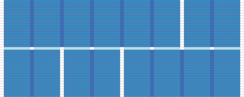
Gutters
Gutters are the empty spaces between elements, either vertically between units, columns and regions or horizontally between fields.
How to build a grid
Now that you have a good understanding of grid systems and things to consider before creating a grid, the actual art of creating a grid is fairly simple.
This method is for working out your grids for Photoshop / Sketch rather than in final development (unfortunately we can’t use Sass mixins in Photoshop / Sketch so we need to work with pixels rather than percentages. Boo).
Firstly you need to assess the constraints in the brief. In this example we will be producing a grid for a blog that requires a Google AdSense Large Unit (336px X 280px) in the aside. As mentioned, this constraint actually provides a great starting point for our grid system. We know the ad unit has to be there so we can build around it and accommodate it with our grid.
It’s a good idea to base a grid on your max-width device rather than mobile first. This is because your grid will be used to assist in placing content, which is much more difficult on larger devices than on mobile where you’re likely to stack content in one column.
We’ll use 1200px as the wrapper width for our site because it’s a comfortable fit for standard monitor sizes (1280px X 1024px) and also divides well into base 4.
Base 4 is a design concept that all of the math used on your site should be divisible by the standard em size of 16px (4 * 4 = 16). A good example is in body copy, 1em (16px) is a good size for standard body copy, as a rule of thumb line-height should be 150% of the font-size which in this case is 24px (4 * 6 = 24)
1200 goes very neatly into base 4: 1200 / 4 = 300, 1200 / 8 = 150, 1200 / 12 = 100, 1200 / 16 = 75 and so on making it the perfect wrapper for our grid.
To work out our unit widths we can use a simple formula of
(Total Width / Unit Count) - Gutter Width = Sum

((Sum * Unit Count) - Gutter Width) / Unit Count = Final
For example a 1200px total width page with an 8 unit grid and 16px gutter can be worked out like so:
(1200 / 8) - 16 = 134To get out final unit width we need to subtract the remainder and divide the sum by our unit count to get the final unit width:
((134 * 8) - 16) / 8 = 132Now we’ve got the math out of the way, let’s place our fixed constraint ad unit onto a page and add in the most basic unit grid we can using base 4 (4 * 4) with a 16px gutter.
1200 - 4 units Large Ad ColumnThe Ad banner is a little too wide for a single unit. Centring it in a column of two units fits but causes the banner to sit almost in the middle of the page, not so good for our layout!
Taking the grid up another notch on base 4 to 8 * 8 gives us a better balance. The ad unit can be constrained to a three unit column giving us more space for our main content.
1200 - 8 units Large Ad ColumnHowever the aside is a little wide and we have plenty of space wasted either side of our ad unit which would be better used in the main content.
Stepping up to 12 * 12 causes our math to break a little bit by leaving us with a unit count of 82.666… and obviously we don’t want to be off pixel. We can solve this by amending the gutter from our ideal 16px down to 12px which leaves us with a nice round 87.
1200 - 12 units Large Ad ColumnOur aside is looking much more balanced to the content here and the unit count will give us a column count of 3 which works really well for our content. 2 columns for the article and 1 column for the aside.
1200 - 12 units Large Ad RegionThe aim is to get your grid to work by using the simplest grid possible (least number of units / columns / regions). We could go up further to 16 / 20 / 24 etc units but we run into the trap of providing ourselves with too many possibilities when laying out content, less is more here as with most other things in design, we have what we need.
Of course in production we can use Sass mixins or grid frameworks such as Susy or Jeet to recreate our ideal grid in a responsive environment but this method works well in working out a grid for our initial design documents.
Further reading and resources
Ordering Disorder by Khoi Vinh is a great read about creating grids for the web and goes into much more in-depth practical examples than I have.
Grid Systems in Graphic Design by the grandmaster of grids Josef Mülller-Brockmann is a must read for any designer. The book goes into a lot of detail and craft about creating grids [for print].
Massimo Vignelli’s Cannon has an interesting section on grids. This book is my design bible and is definitely worth a read.
Grid.guide is a great online resource to help you make grids. Simply put your width in and number of columns and it will work it out for you, magic!
And finally Guide Guide is a great Photoshop extension for creating grids using PS guides.