Rentalcars
Rentalcars.com is the worlds biggest online car rental service, providing its thousands of daily users access to over 900 car rental companies in 160 countries.
During my time at Booking I was responsible for leading the Rentalcars design team.
Design played an important role in the product lifecycle by having talented user experience designers embedded within product teams that consisted of analysts, developers and product owners. These teams were self-sufficient and owned either a page (“search”) or part of the holistic user experience (“payment”).
This make-up was the catalyst for the success of the site by allowing the teams to solve problems for their users; however, that’s precisely what the teams did, they solved problems for only the users of their specific area of the site. But also caused a great deal of inconsistency across the website which was reflected in qualitative research that contributed to issues around usability and trust in the product.
The pitch
With this in mind, we put together a pitch to the leadership team to highlight the discrepancies and frame what this meant to the users while also structuring the discussions around how the current design and development practices were creating waste by having teams re-making components over and over again. The conclusion being that if we took a holistic approach to design (thinking end-to-end) we would be able to give the teams more time to solve problems by providing a consistent toolbox of components and templates to work in.
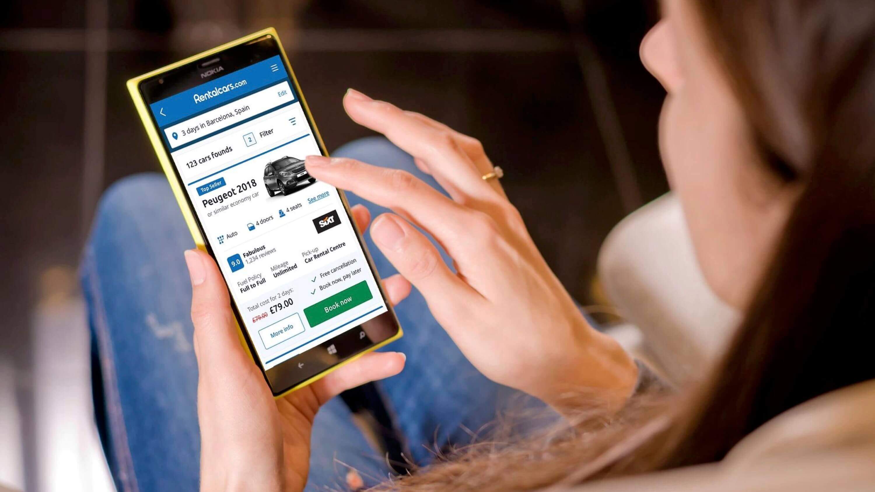
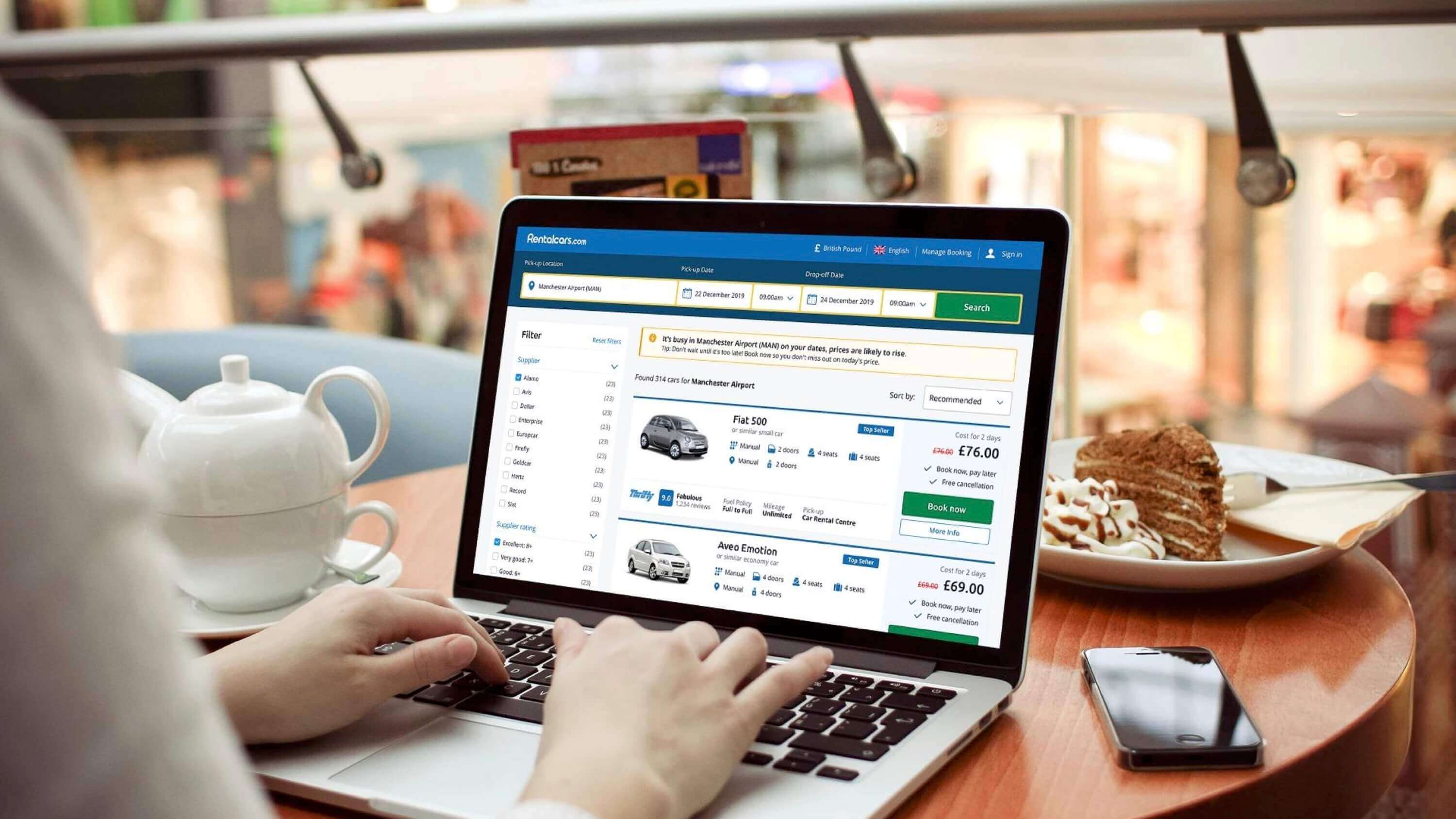
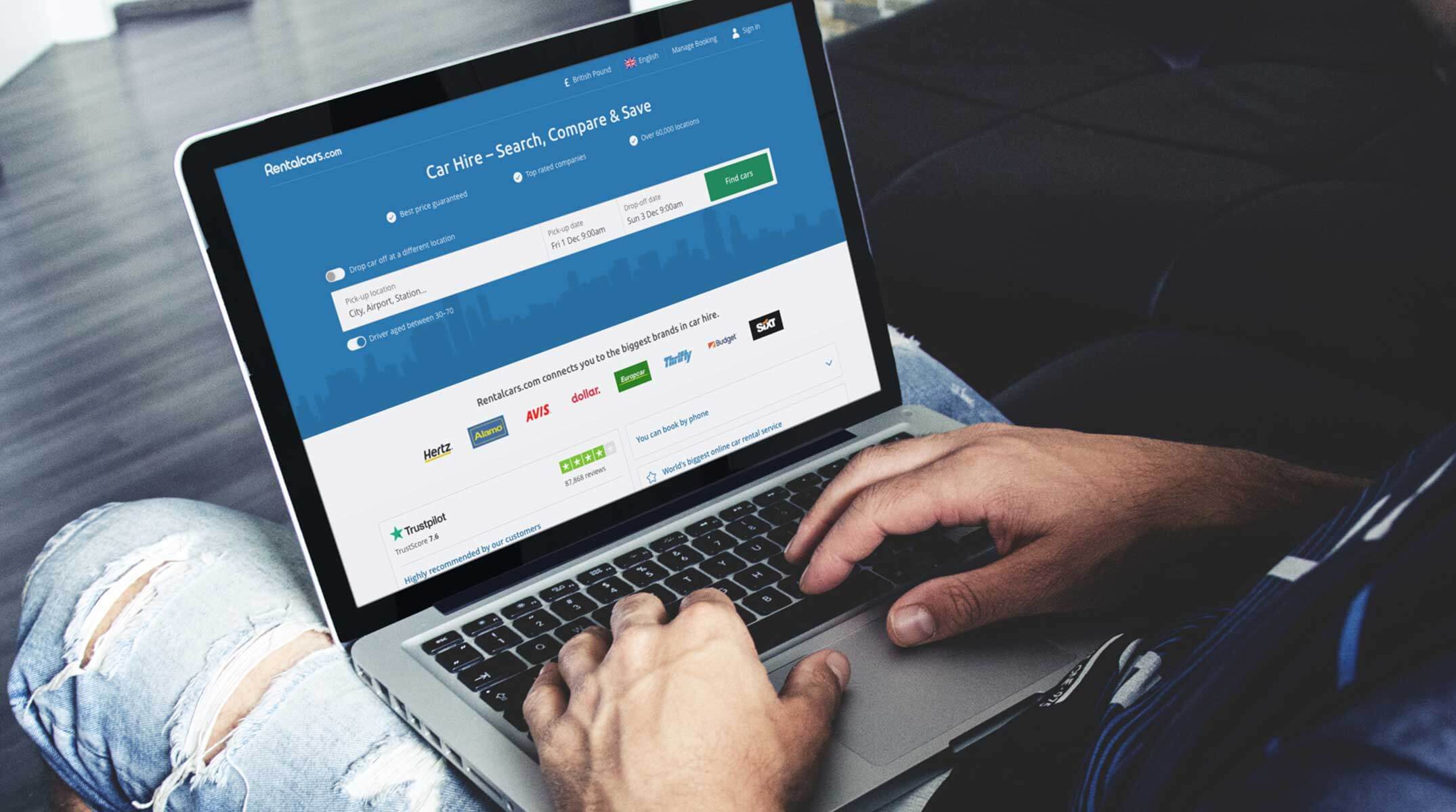
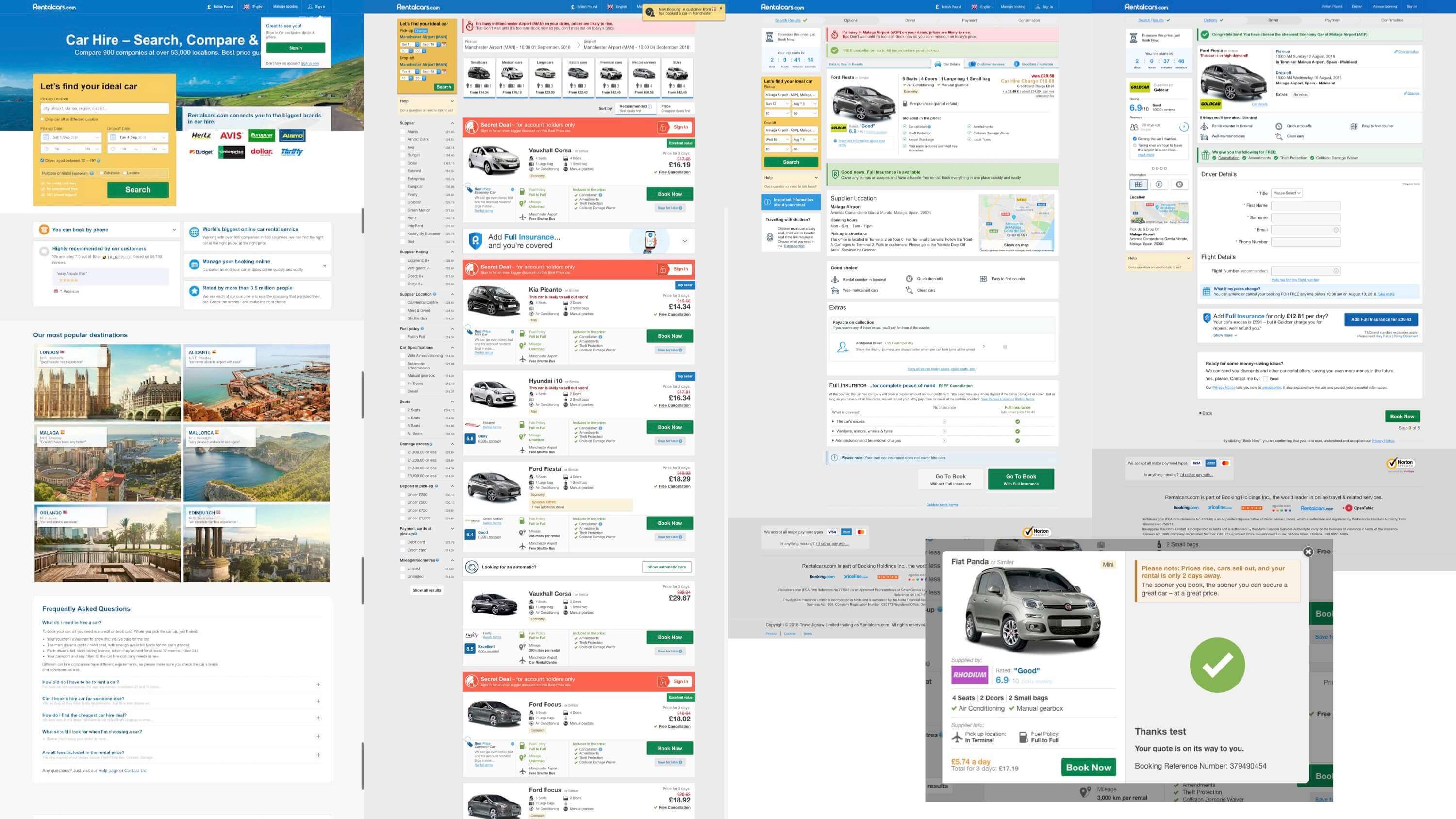
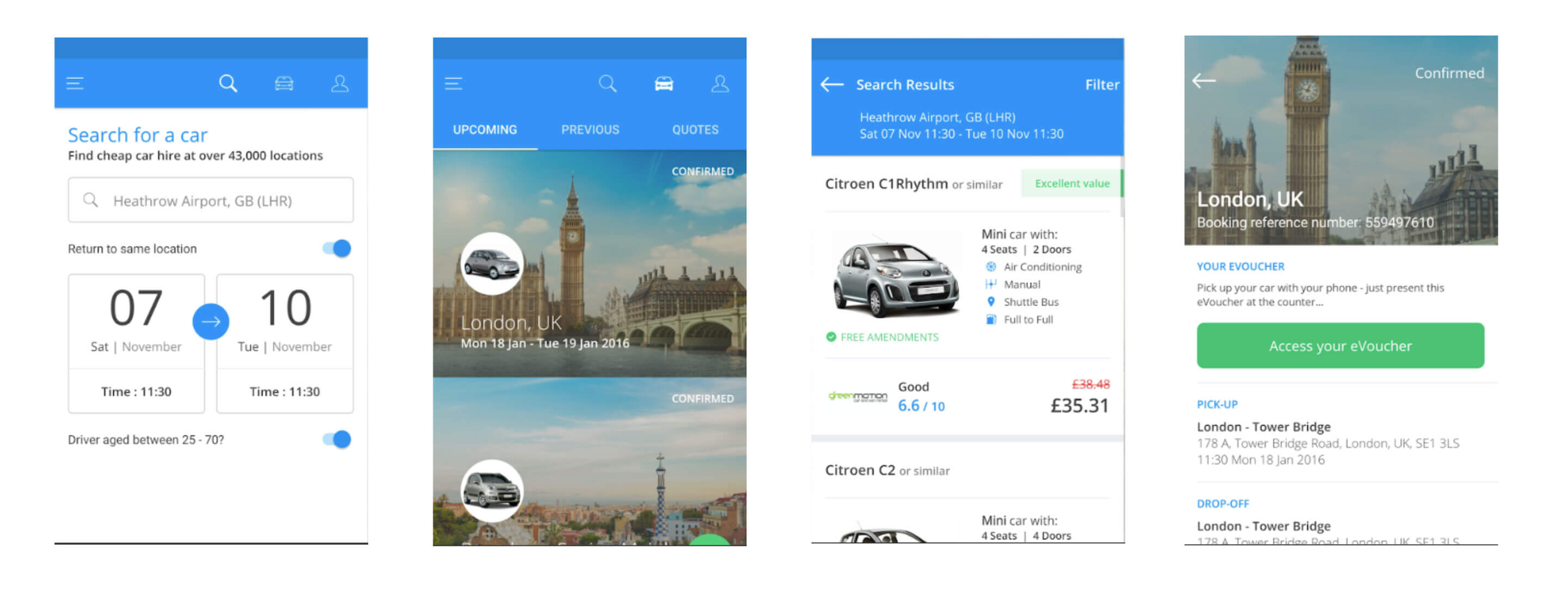
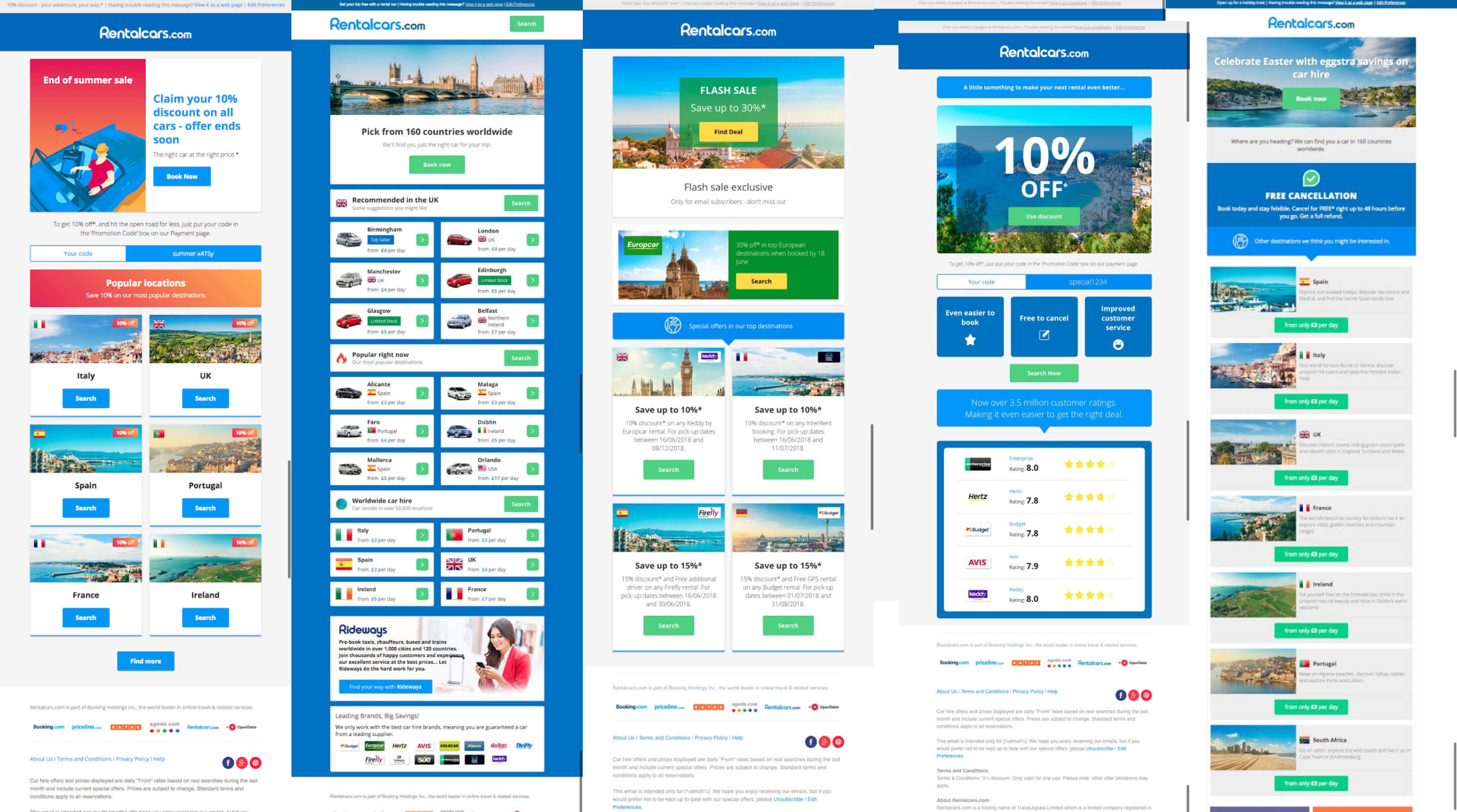
We highlighted the journeys and design language used through the current adaptive web experience (separate mobile and desktop codebases) along with the app and email products which had evolved in isolation.
Discovery
We secured budget to perform an initial discovery phase to understand and define the current product jobs to be done (from lenses of the user, business and technology), map the journeys and run a design sprint to explore a coherent experience.
The initial exercise involved mapping the journey across the main web experience. To do this we interviewed product owners and designers across the teams that owned parts of this experience to gain a first hand understanding of what each area was doing and where it lead.
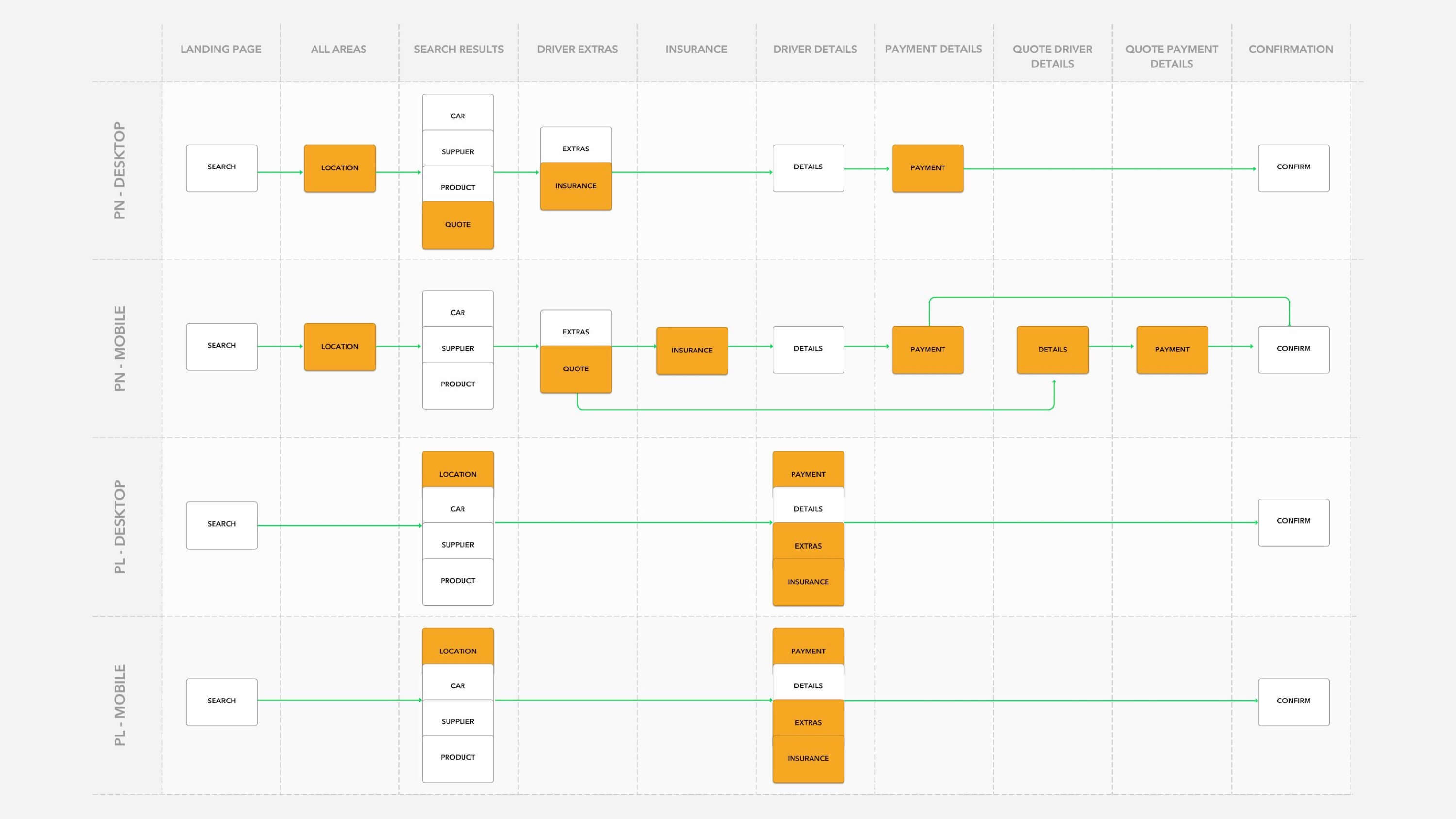
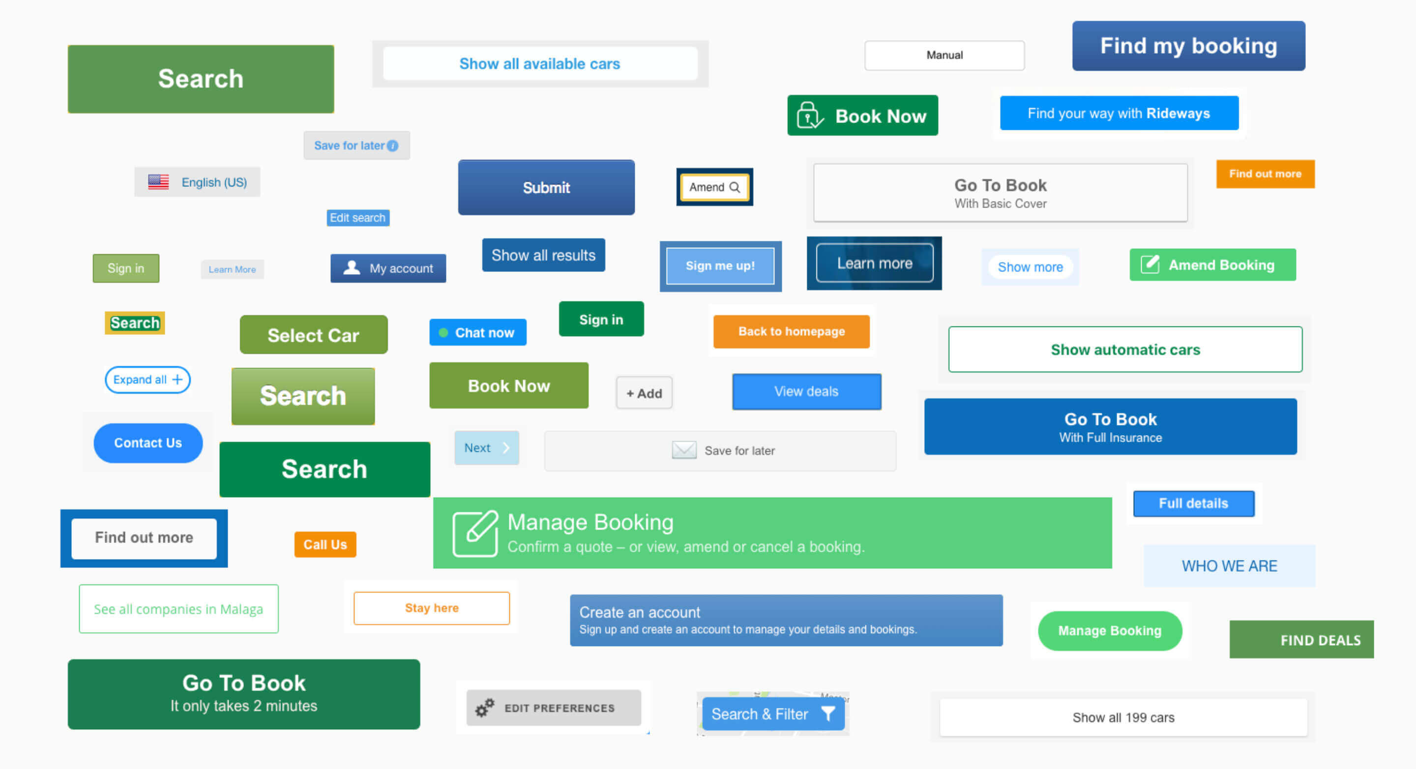
This is a small snapshot of the overall journey map that showcases the aforementioned inconsistencies spread to the experience, not just the design language. Each row is a separate codebase and website with the columns representing the steps (pages) of the journey. Sections highlighted in orange were deemed to be so different from their counterparts in the other products shown that a simple lift and shift into one experience would cause issues with the coherency of the journey (information and onward journeys in different places etc)
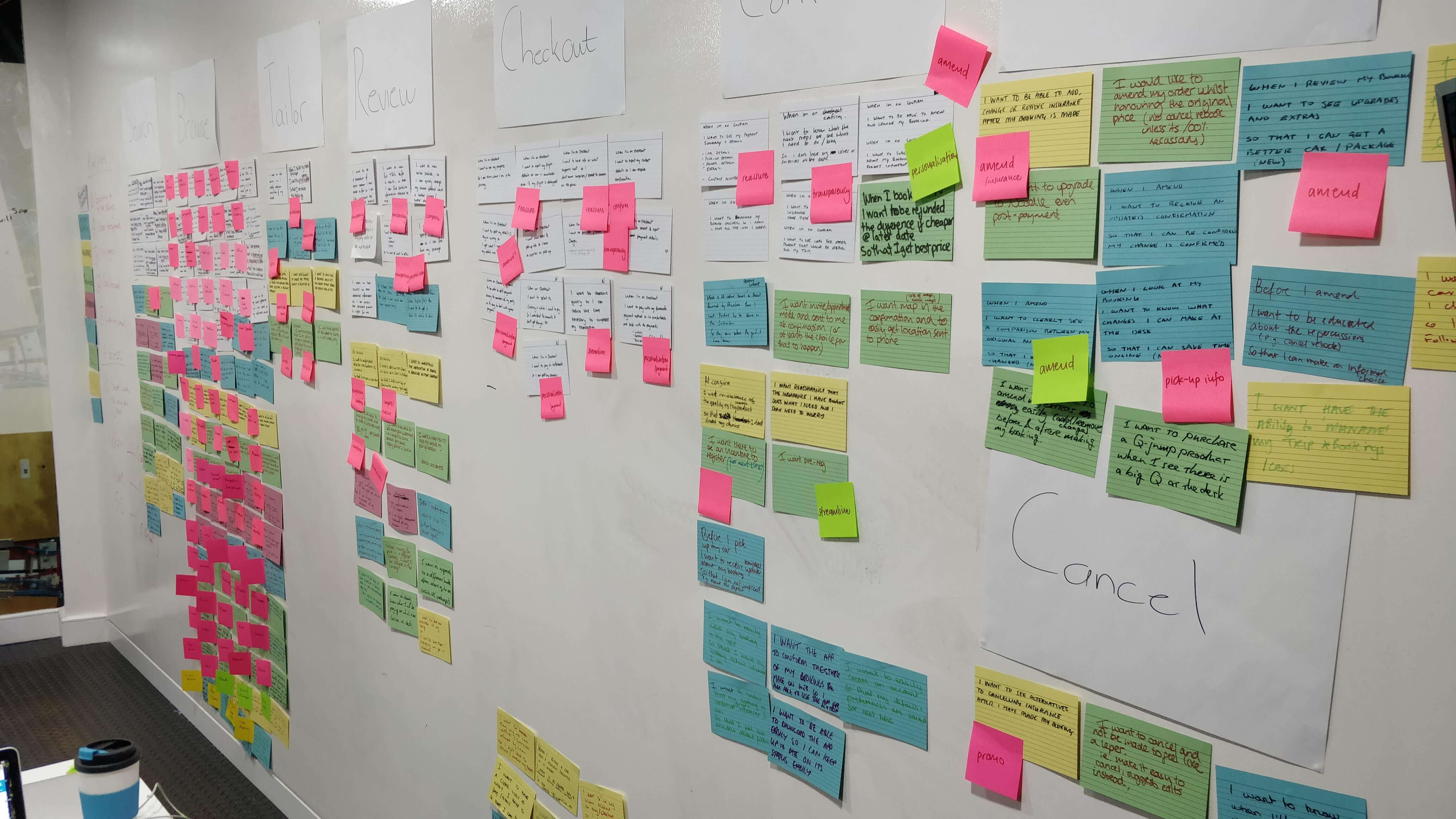
The next step was to understand and define the current product. We again invited the product owners from each area to take part in a jobs workshop where we plotted each user, business and tech requirement onto a wall. This was the first time Rental Cars had a deep map of requirements across the whole product and became a great learning experience for all involved (along with the leadership team). We ran 8 sessions with 40 people across 19 teams to define 203 job stories.
Design sprints
Once we had a good understanding of the product we moved onto the design sprint where we broke each job into hypothesis and ran workshop exercises to flesh each out into a specific user experience for that task. Along side these sessions we also explored what the ideal car rental experience journey would be, starting from scratch to allow freedom of thought and escape the common mind-set of “my thing needs to be here and do this”.
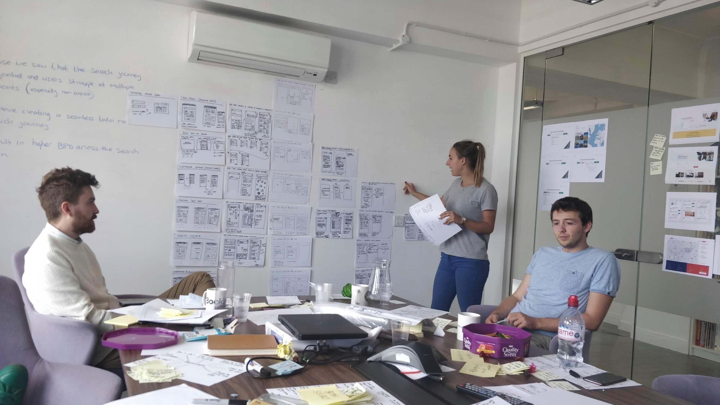
The team regularly shared its findings by running design critiques at each stage of the sprint process and opening its doors to the wider company to ensure collaboration and to promote an inclusive mindset for the discovery project.
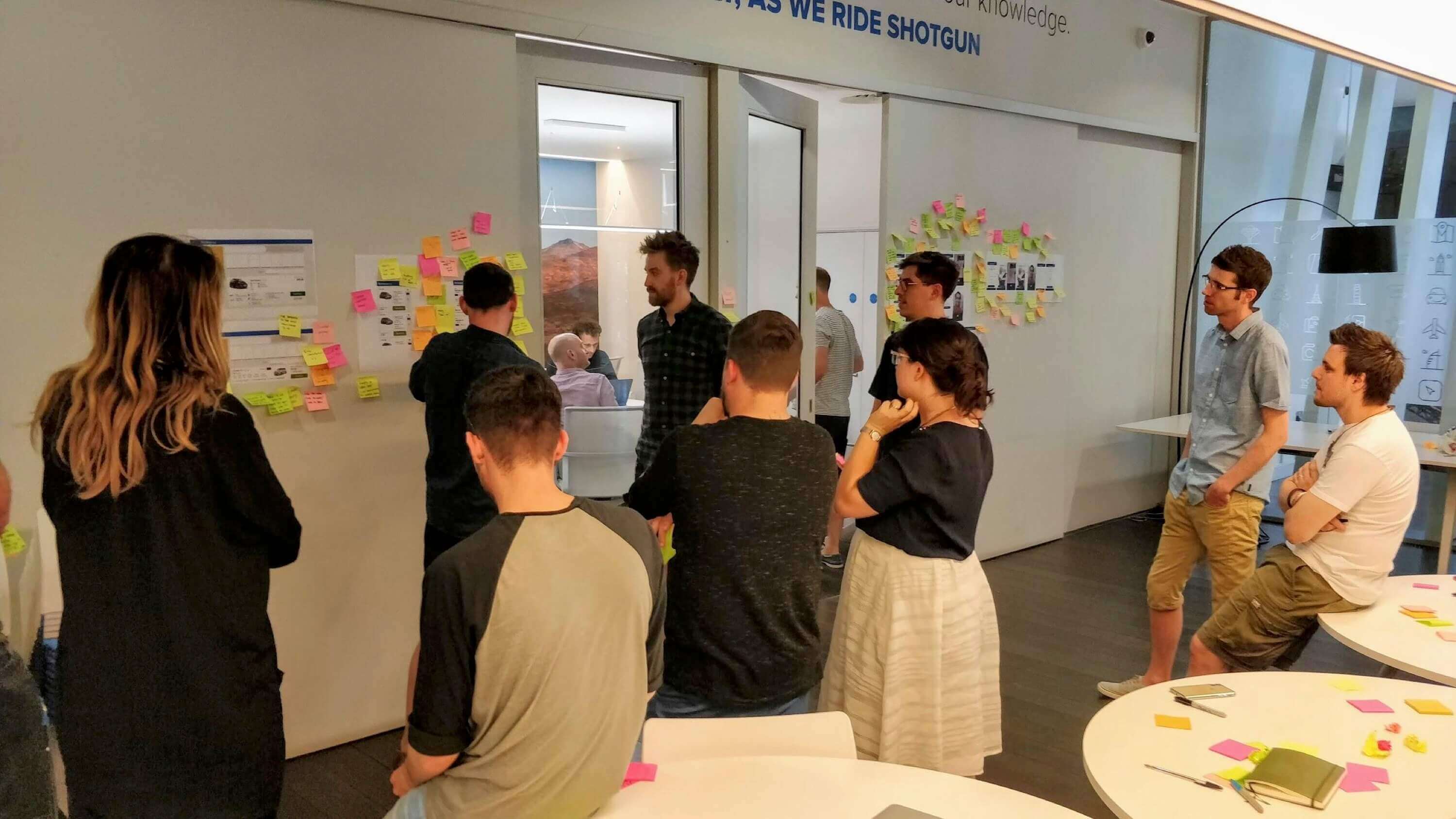
After the initial sprint we had a wide divergence of ideas that had converged to a handful of prototypes that we could test in a local user study lab against a control of the current site. We spoke to a mix of existing customers and those new to the market (planning upcoming trips that may require car hire).
We took this feedback into a second sprint and again diverged our thinking to explore the parts of the experiences that had resonated well with users and dig a little deeper into those that hadn’t. We ran additional user testing sessions locally and remotely across Europe and in the United States (both prime operating locations for the company).
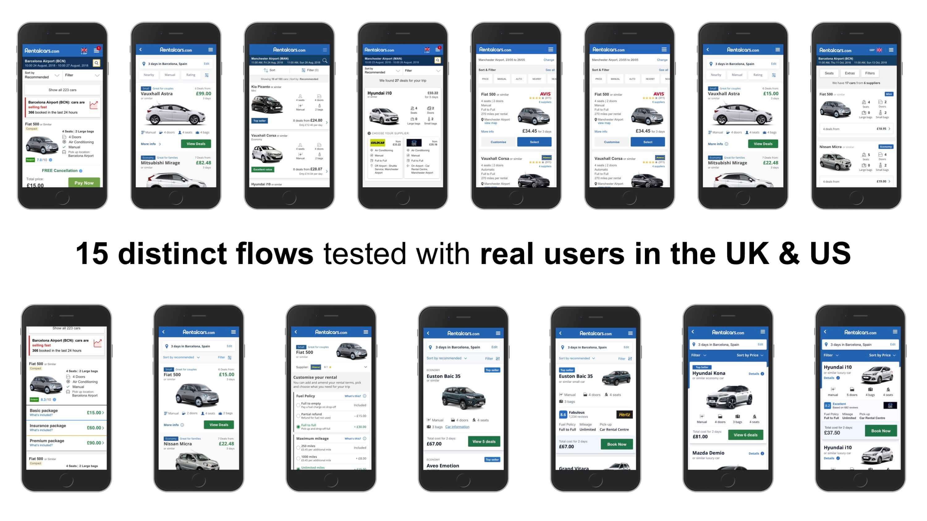
The proposal
At the end of these sessions we had tested 15 distinct flows across the Rental Cars user experience and were able to narrow our thinking into one proposed flow and structure for the site.
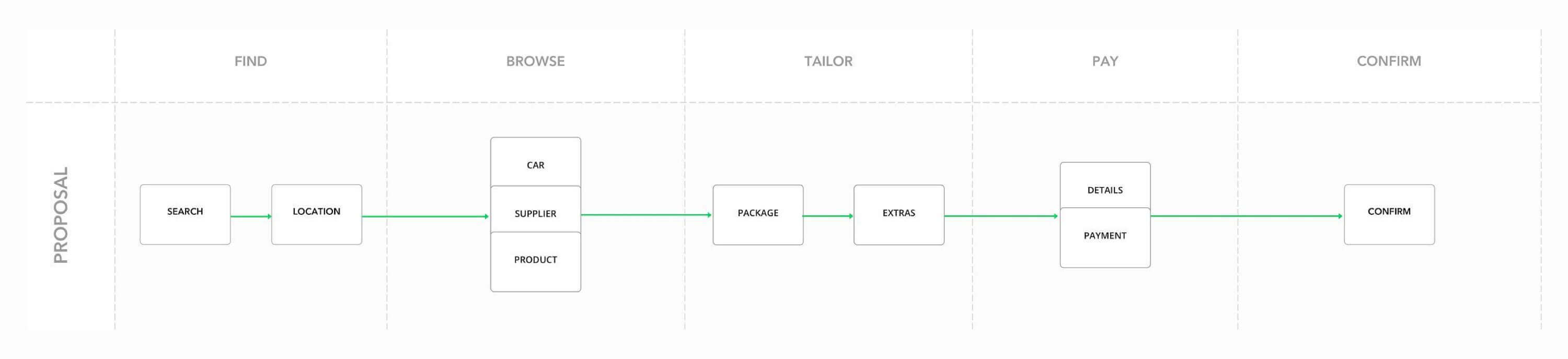
This proposal along with the prototypes were fed back to the leadership team that saw real value in the work we had done so far and again signed off further budget to put this work into action. This step was far greater than the initial discovery phase where the proposed roadmaps for teams had been amended to accommodate the design and development planning and work needed to re-platform the site onto our proposal.
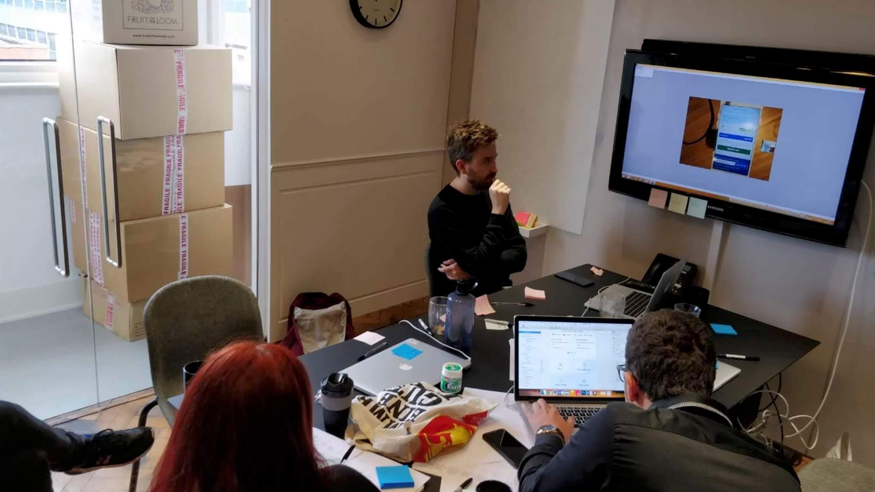
To achieve this we again ran further sprints, this time aimed at componentising and redefining the design language used across the proposition to create a MVP design for the new proposal (moving it on from prototype to scoped and defined end-to-end experience). At all stages this again tested with users both qualitatively (in labs and remote testing) and quantitively through A/B experimentation on the current platform.
The new Rental Cars