Look Fantastic
Look Fantastic is the leading online destination for beauty and grooming products in Europe.
I was asked by The Hut Group (Look Fantastics parent company) to review the current website and provide user experience feedback and art direction for their internal team to build upon to enhance the digital experience for their customers and help move the brands perception towards premium luxury.
The users
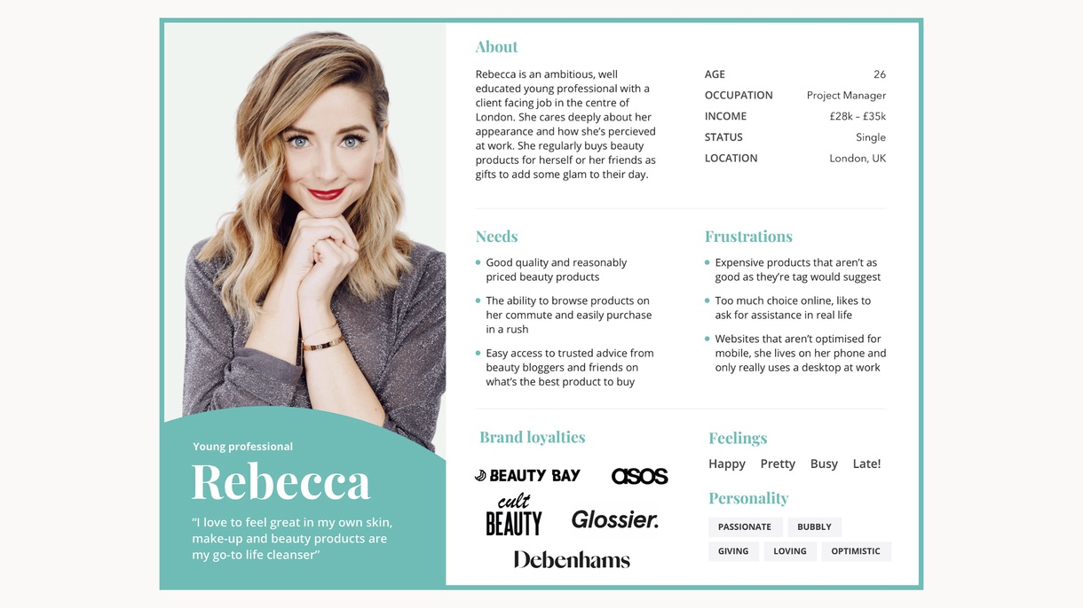
The internal design team tended to use a set of personas based on generic Hut Group users, these personas spanned many different sites and locations which didn’t reflect the Look Fantastic userbase directly. I started by initially putting together a set of proto-personas that more closely reflected the young and ambitious users for the beauty brand.
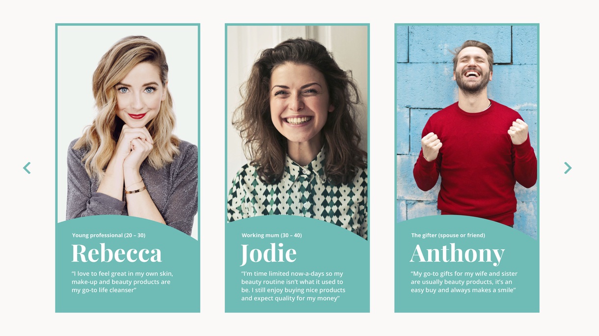
To do this I spoke with real users sourced through the Hut Group, I interviewed each and asked what their usual shopping habits were for beauty and grooming products. Looking at where they shopped and their experiences with competitors and Look Fantastic.
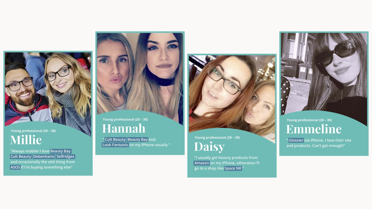
I put together a set of in-depth personas to help the internal team better understand their userbase and shift their design thinking onto real users opposed to their own opinions.
The experience
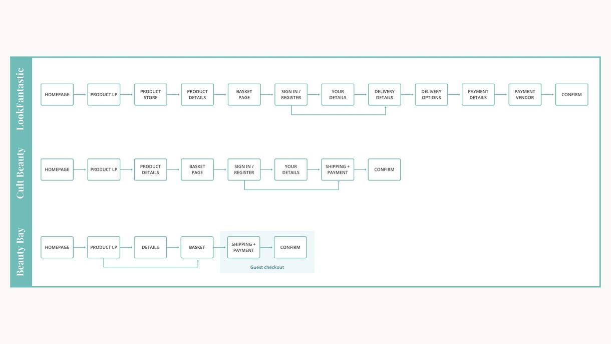
I also mapped competitors websites against the current Look Fantastic user journey to benchmark the experience and highlight potential issues around complexities in the site vs competitors that had streamlined their experiences (something that resonated well with the target demographics).
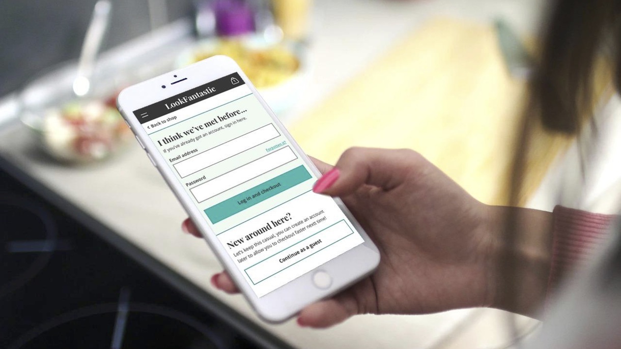
The next steps were to put the current site through its paces and get insights from real users. To do this I put out remote tests targeting various personas and asked them to complete natural tasks that allowed them to be honest with their feedback.
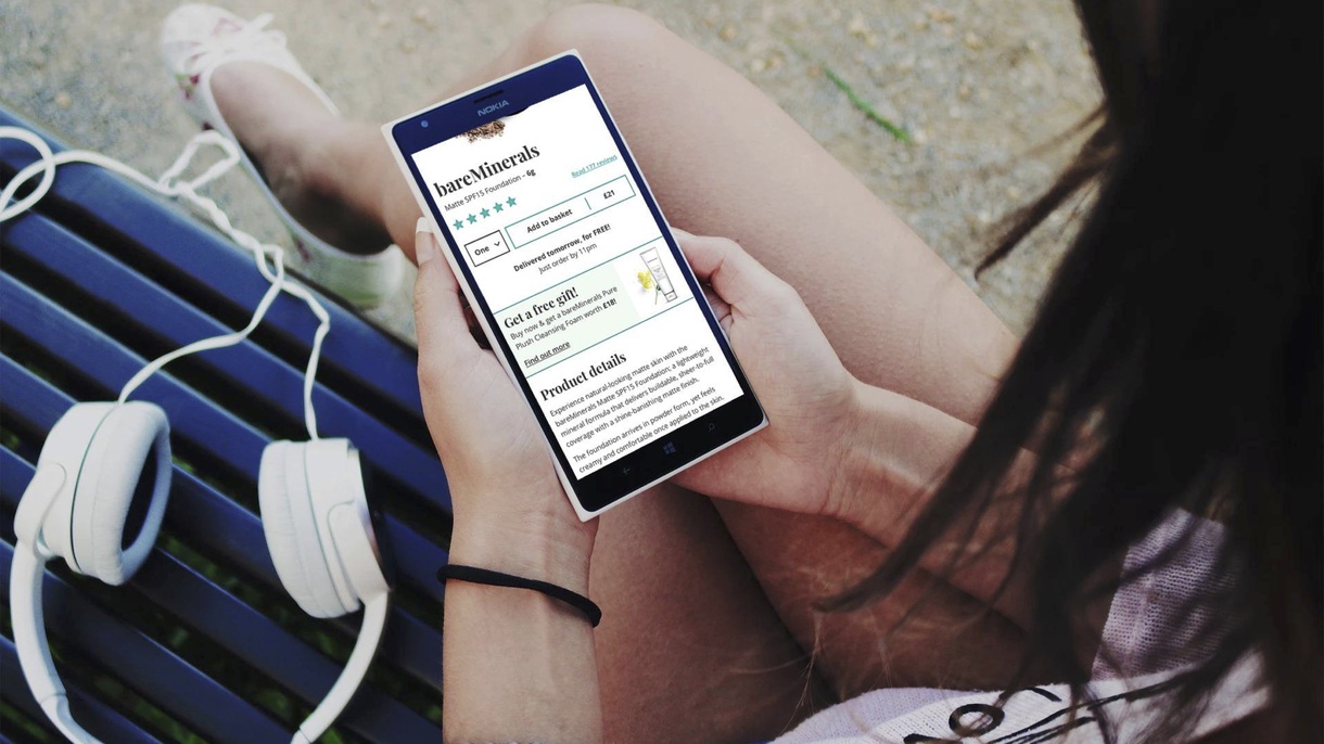
Here is an example of some of the feedback we received, in general the site was good. It did its job and had a lot of features users really enjoyed such as product reviews.
What I ended up pulling from the user testing was that although the site has some great features and a good product selection; users perceived the brand and website in the cheap supermarket bracket (likening it to Superdrug) which was very much the opposite of where the Hut Group wanted to push the experience.
The hypothesis
To frame the work I put together a hypothesis that highlighted the research and avenues we could explore to help bring the site from bargain basement to established luxury beauty destination.
Because we saw users generally like the site and products available but don’t specifically view LookFantastic as a premium beauty brand.
We believe tailoring the default Ingenuity experience to be more appealing to the beauty segment.
Will result in a bespoke product that will enhance the experience for our users.
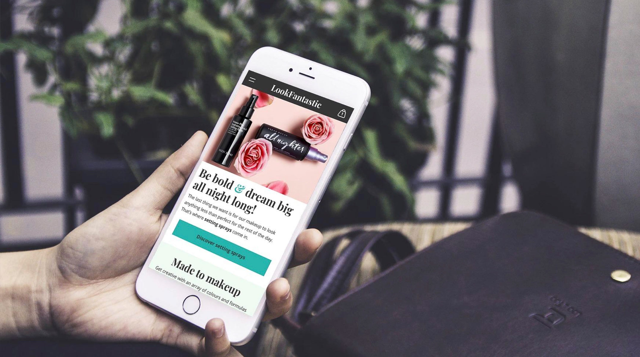
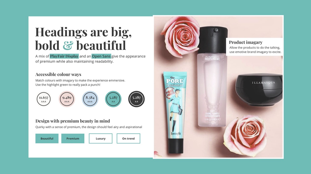
Art direction
To create an initial art direction I explored the competitors our initial user panel mentioned using and took a wide view of the design langue being used to appeal to the target personas. Along with competitors, the users mentioned actively subscribing and interacting with beauty bloggers as part of their normal beauty shopping routine. As we already understood that Look Fantastic had a great blogging offering onsite, this would be a great opportunity to define a USP that would appeal to the users.
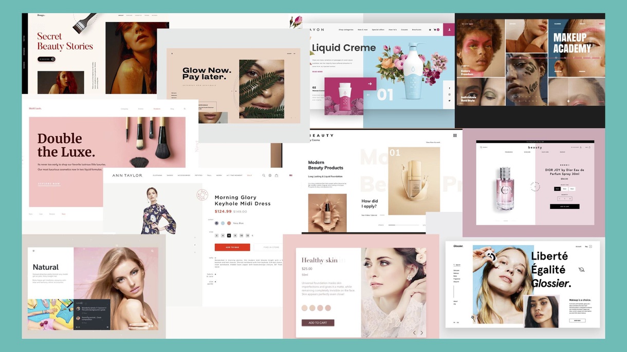
The next step was to take this influence and apply it to a suite of style tiles that we could use to gather feedback from users on our possible directions.
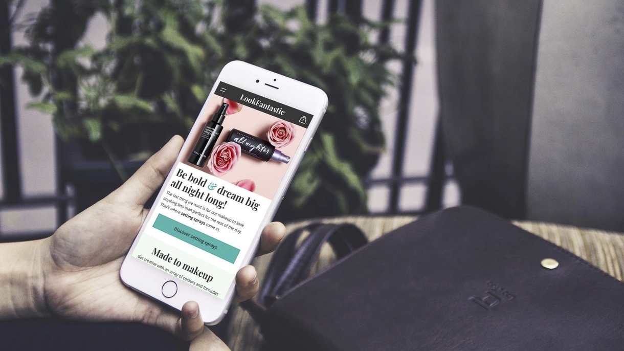
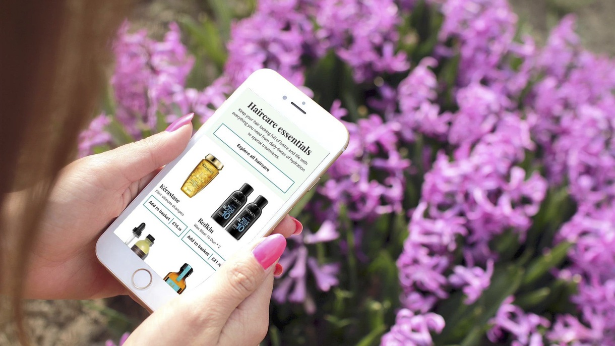
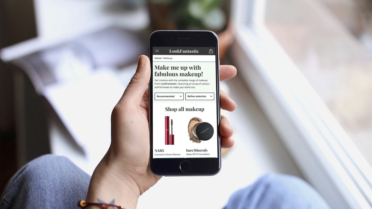
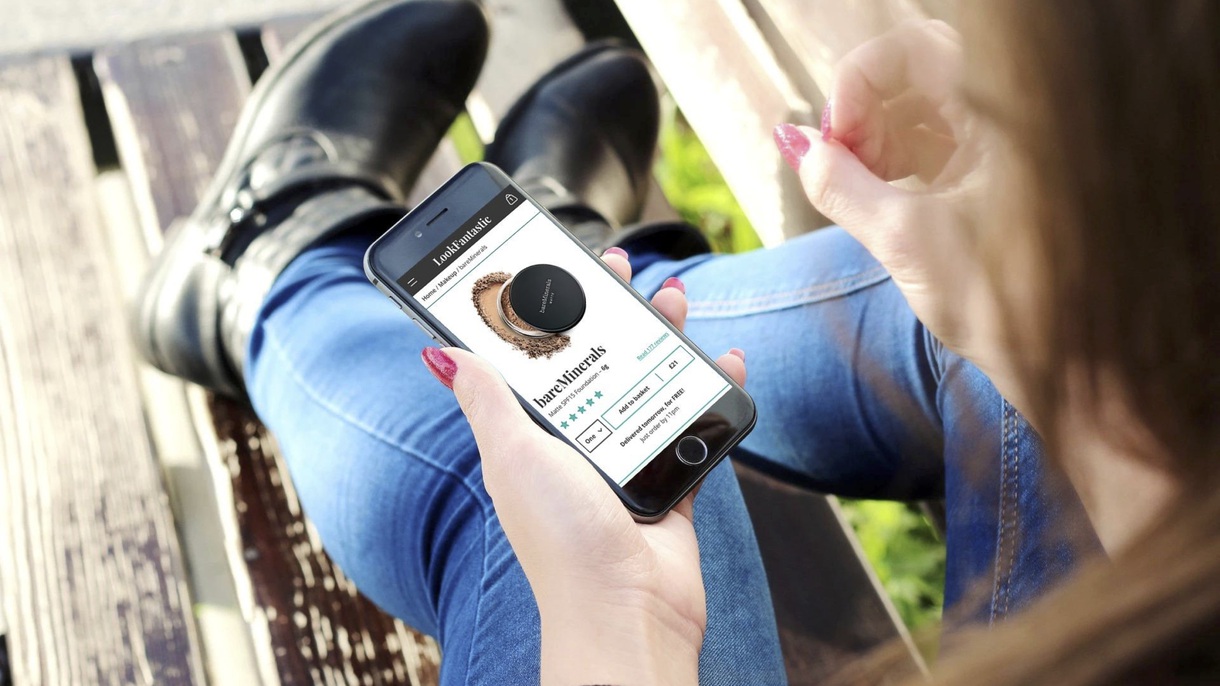
The new Look Fantastic
After gathering feedback and testing various user flows I put together a prototype that fleshed out the thinking into a solid grounding for the internal design team to build upon.